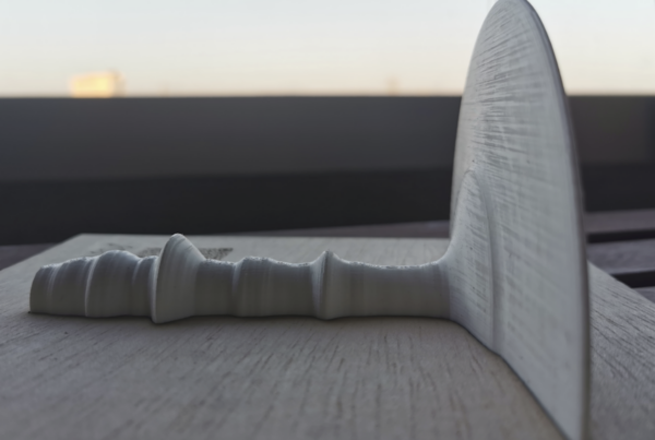
This sculpture aims to emphasize how data became a relevant asset during the COVID pandemic, and underline the importance of data teams who curated the data during the crisis.
The chosen theme for the sculpture is the progression of COVID cases in a given company, since May 2020 through March 2022, when data collection stopped. The sculpture recasts a compnay’s data, which replicates the general trend, and shows the number of COVID cases registered with a 10 day moving average. The big wave on the right corresponds to OMICRON, when citizens were allowed not to wear masks during Christmas and a large majority of population had been vaccinated.
The sculpture is is built on acrilic resin and embedded in a wooden frame. All materials are 100% natural and recyclable. The sculpture is 15 cm wide, 15 cm long and 7 cm tall.
Artists: Antonio Moneo and David San Román
FEEL

REMEMBER
If COVID revealed anything, it was the importance of data. Since the start of the pandemic (March 2020), data has been the key tool for understanding the seriousness of the situation, designing responses in real time and in a coordinated manner, and projecting alternative scenarios to reflect on a strategy for exiting the crisis with implications for the economy, or coexistence. Furthermore, the data determined in many ways the lives of citizens because they determined the phases of exit from confinement, the policies for social gatherings or the use of masks, among others.
This sculpture represents a time series of COVID cases in a company, although it accurately reproduces the public data published by other public administrations and health organizations. The purpose of the sculpture is to pay tribute to the teams that worked on the management of this data, guaranteeing its accuracy and constant updating, a task that is not easy and little known by the widest public.
What is not seen in the data series
Behind each point in this series of data is the work of those who worked to make the data accurate and robust, not an easy task due to the enormous complexities associated with this data, among which are:
- The disease was not well known and there were classification errors: at the beginning of the pandemic it was difficult to properly identify a patient. The symptoms were not clear and there was not enough evidence available to carry out mass testing.
- Management tools were not designed in many cases to process this type of data: the pandemic required individualized monitoring of people and, in many cases, especially in the field of company health, personnel management systems were not prepared to collect medical information.
- The health regulation introduced changes in the way of measurement, and there were constant variations. On successive occasions, the criteria for identifying vulnerable people changed, forcing the records to be constantly reclassified.
- The application of data protection regulations increased the complexity of data processing. In order to guarantee people’s right to privacy, mechanisms had to be introduced to protect their health information.
- Although daily monitoring was done, adjustments had to be made from time to time because the data was out of date. In many cases, there were notifications of COVID cases that subsequently did not persist and generated false positives.
- The data had a weekly cadence, and on Mondays the accumulated data of the weekend was presented, introducing alterations in the data series.
- The data was revealing what our detection capacity allowed and, therefore, the comparability of the data over time is a relatively complex exercise. For example, the arrival of vaccines caused the explosion of cases in winter 2021 (Omicron variant) to generate a lower mortality rate than in previous waves.
- These are some of the complexities that many data and technology teams had to deal with during the pandemic period. Serve this sculpture to value your contribution to the resolution of this complex period.
ACT
The Tangible Data project turns emblematic data sets into physical sculptures with the aim of highlighting their relevance and encouraging, in a non-digital context, debate and action.
If the sculpture, the data or the story behind this sculpture have caught your attention and you want to collaborate, Tangible Data recommends making a contribution to the Carlos III Institute through their donations page

